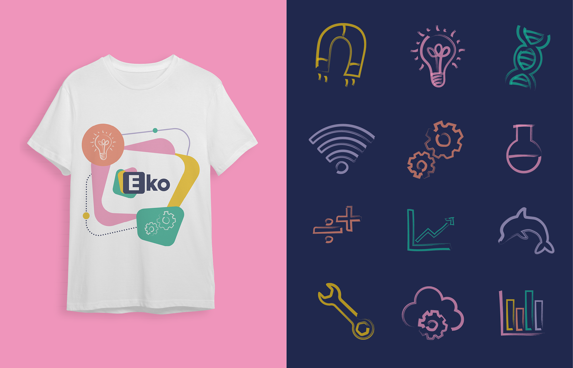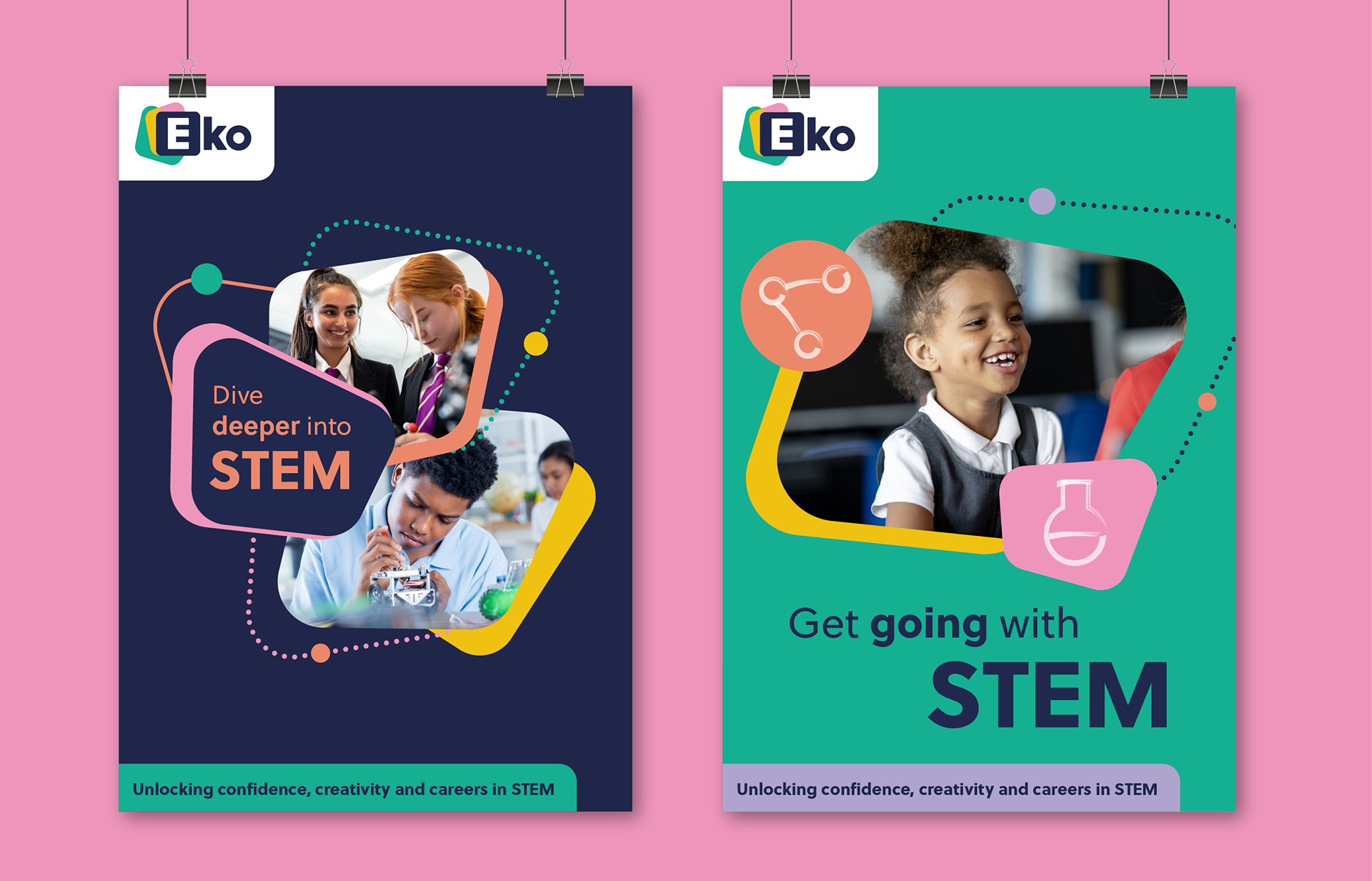
The different positions and angles create a dynamic brand to show the many career paths STEM offers. It also introduces the idea of depth and finding what’s beneath the surface. The letter ‘E’ on the logo is housed in a curved box, visually offering a subtle nod to a periodic table. The dark blue colour is used for older audiences, and the bright teal for younger.